Group project for social good:
“PathFinders”
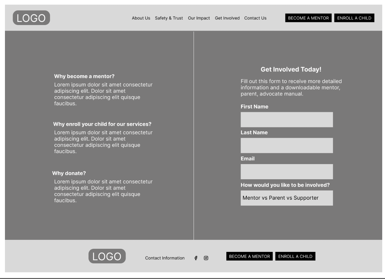
PathFinders is a website designed for a youth mentorship program that focuses on connecting young individuals with supportive, well-matched mentors. The platform is built to serve both mentors and parents or guardians, allowing them to explore profiles, learn about the program, and identify the best possible matches based on interests, goals, and needs. With a clear and user-friendly interface, the website simplifies the process of discovering, evaluating, and forming meaningful mentorship connections. This project was a collaboration with
Najya Washington as lead researcher
Eva Alperovich as lead designer
and myself as lead tester and documentor
Problem statement
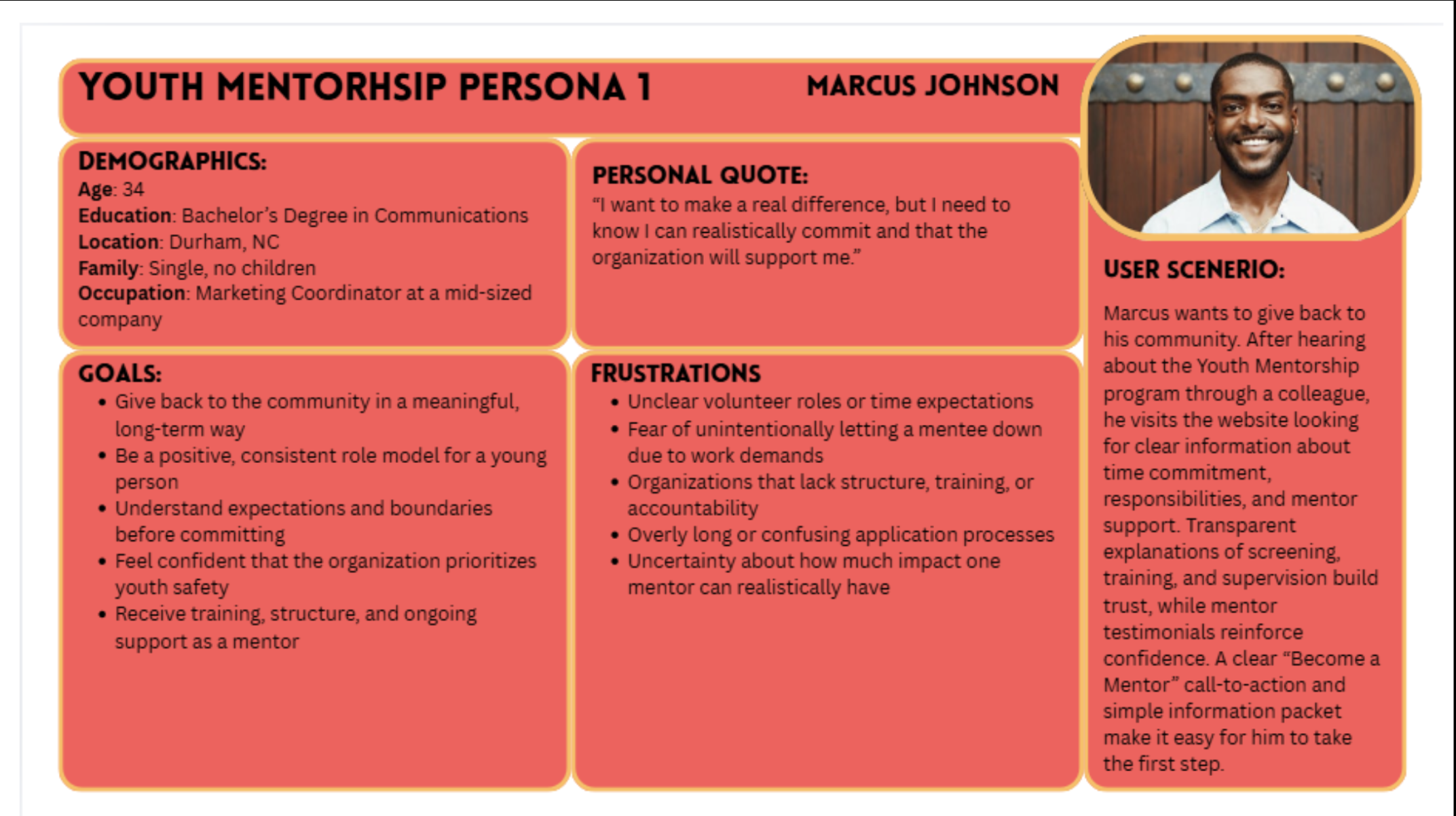
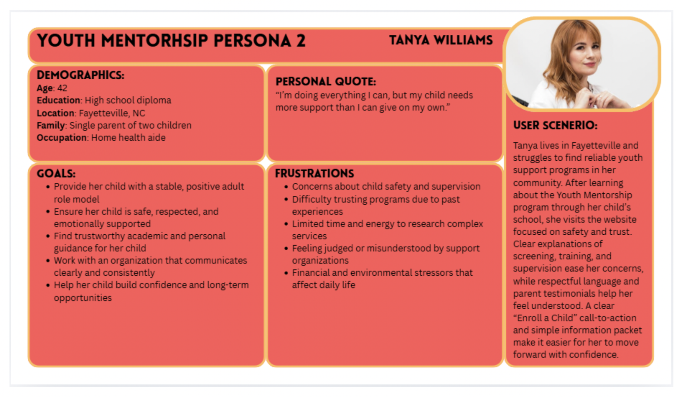
At-risk youth in the community would benefit significantly from consistent mentorship and guidance; however, research and community outreach indicates that there is currently no clear or trusted digital pathway for youth, parents/guardians, or volunteers to learn about or join a mentorship program. Parents and guardians express concern about safety, screening processes, and program structure, while potential volunteers lack clarity around expectations and next steps.
As a result, the youth in the community find themselves in troubling situations, no after-school programs and few to no extracurriculars that they can participate in with low cost. Research indicates that these youth would benefit greatly from an online program that allows them to find mentors near them. One where parents and guardians can pre-screen the adults they would entrust with their children. This webpage should also be user-friendly for a wide range of ages (youth-parent/guardian age).
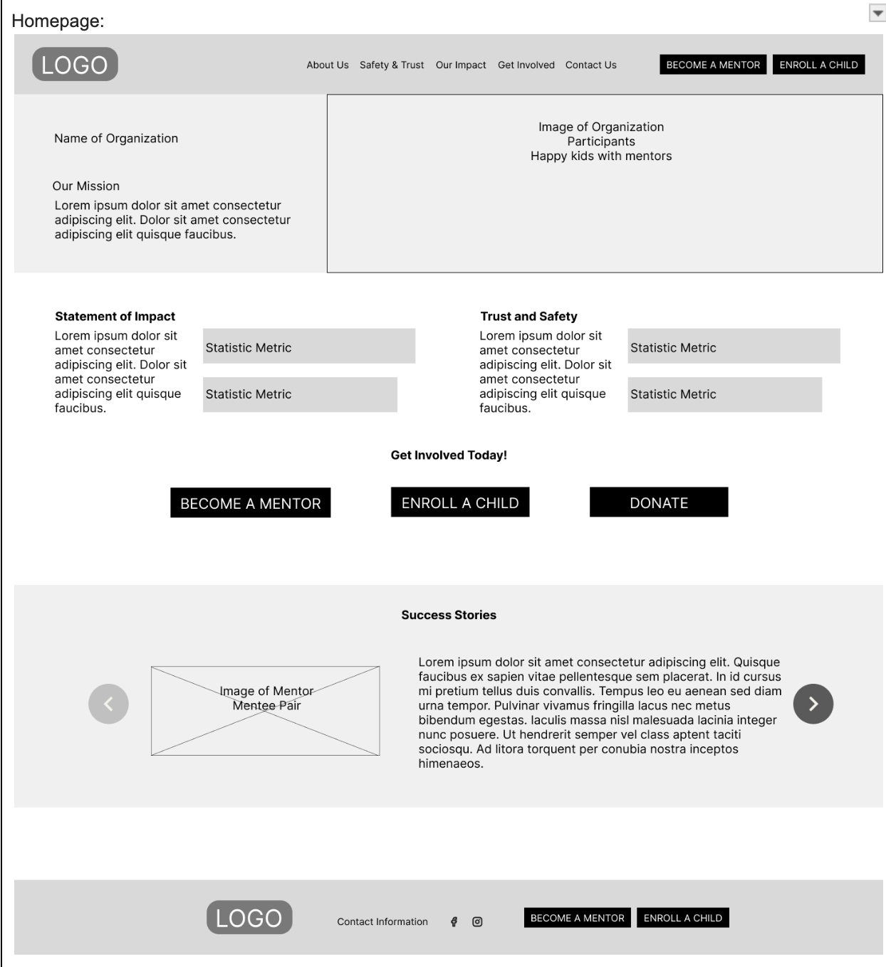
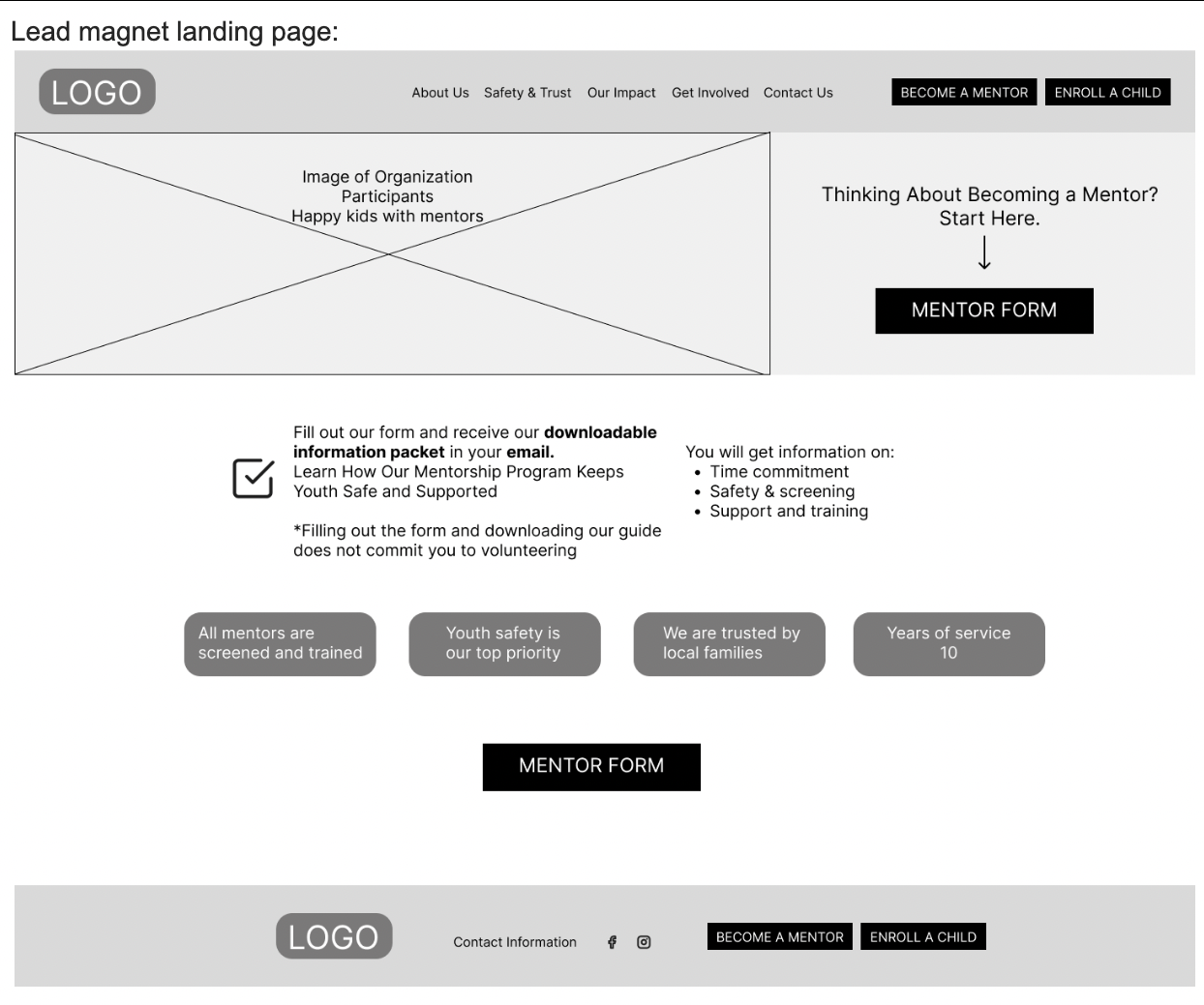
Wireframes
Usability Testing
The usability test showed that users found the website generally easy to navigate and appreciated clear sections like the mentorship checklist and safety information, but several issues affected the experience. Key features such as buttons, dropdowns, and the donate option were unclear or not working, and important items like the downloadable packet were hard to find. While the content felt informative and not overwhelming, the homepage needed more detail, and adding impactful elements like real stories, along with fixing functionality and navigation, would improve overall usability.
— Test 1The usability test showed that users were generally able to navigate the website easily and found key sections like trust and safety clear and effective, but several areas need improvement. The homepage lacked sufficient information, causing some initial confusion, and navigation elements such as dropdowns and repeated buttons were inconsistent or unclear. Users also had difficulty identifying where to take action, such as enrolling a child or finding the donate option, and suggested making these features more visible and accessible across multiple pages. While the site felt trustworthy and tasks were mostly manageable, adding more detailed content, improving navigation clarity, and enhancing accessibility to important features would strengthen the overall user experience.
— Test 2